




- SectorTransport & Logistics
- LocationUAE
- EngagementBrand strategy · Brand identity · Guidelines · Website
Background
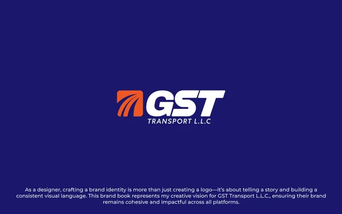
GST Transport had grown steadily, and the brand had not grown with it. That is an ordinary and well-earned problem: the identity was designed for the company that existed when it was made, and nobody stops mid-growth to redraw it.
The challenge
The symptom was inconsistency rather than ugliness. The logo, the printed collateral and the website each told a slightly different story about the same company, and none of them matched the scale of the operation a customer would encounter in person. A prospect meeting the business through its materials formed a smaller impression than a prospect meeting it through its fleet.
Underneath that was a production problem. Every new piece of material, a quotation cover, a vehicle livery, a trade document, required a designer, because there was no system that let anyone else produce something consistent. That makes a brand expensive to run and guarantees drift the moment someone is in a hurry.
How we approached it
Positioning first
We started with what the business is now, not with the logo. Establishing the position settles arguments later: once there is agreement on what the company is, most design decisions stop being matters of taste.
An identity system, not a logo
The deliverable was a system: the mark, how it behaves at different sizes and on different backgrounds, the colour and type rules, and the layout logic that holds across a business card, a vehicle and a web page.
Guidelines written for the people who use them
The brand guidelines were written so the team could produce consistent material without coming back to a designer each time. That was an explicit goal of the project rather than a document produced at the end for completeness.
A website built around the pre-call questions
The site was structured around what a customer actually needs to know before they pick up the phone, rather than around how the company is organised internally. Those two structures are rarely the same, and the second one is the reason so many corporate sites fail to convert.
Decisions that shaped it
We solved the production problem, not just the look
A rebrand that produces a beautiful logo and no system is a brand that degrades within a year. The guidelines were treated as the primary deliverable rather than the appendix.
Structure the site by customer question, not by department
Internal structure is the default way a company describes itself, and it is almost never how a buyer looks for information. We organised the site the second way.
What was delivered
- Brand positioning
- Identity system
- Full brand guidelines
- Website design and build
Where it landed
The company came out of the project with one consistent story across its materials and a system that lets its own team keep it that way.
Services provided
Published with the client's permission. Old Port does not publish performance figures unless the client has confirmed them in writing.